Data Visualization
This guide provides an overview of our containerized visualization system and step-by-step instructions for starting and configuring it using accompanying Python scripts.
Repository and Resources
All Python notebooks and scripts for setting up and configuring the visualization system are available in our GitHub repository:
GitHub Repository: KTH-EXPECA/examples
For a more detailed description of the system, refer to the README.md file in the repository.
Overview
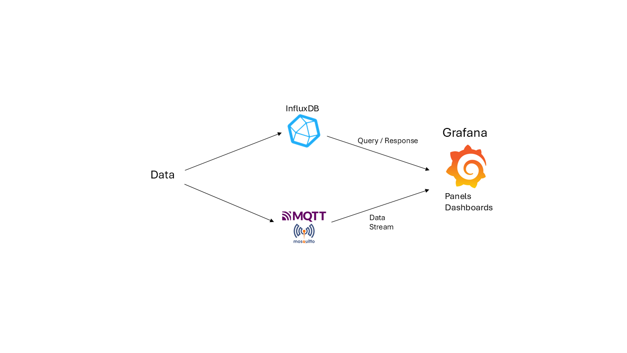
The visualization system is designed to handle time-series data efficiently. Users send data to an InfluxDB database or an MQTT Broker. Grafana then queries the database or receives a data stream from the broker, enabling real-time visualization in a customizable dashboard.
System Architecture
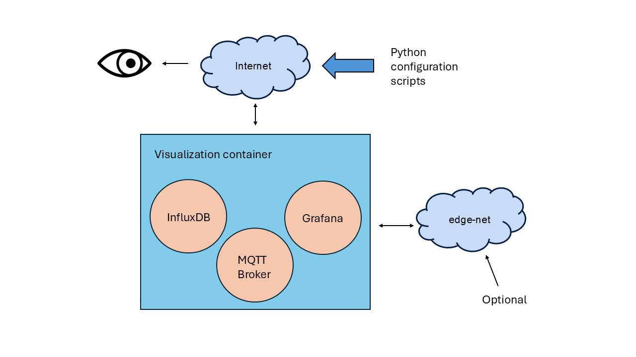
The core components of the system—InfluxDB, MQTT Broker, and Grafana—are packaged within a Docker container that runs on a testbed worker node (server). The container is accessible via a public IP and can optionally connect to an internal “edge-net” network.
High-Level Visualization System Architecture
The system supports multiple networking configurations:
Direct communication over Public IP
Internal connectivity via edge-net
Routing through a user-defined router for additional network flexibility
Full Visualization System Overview
Testbed Configuration
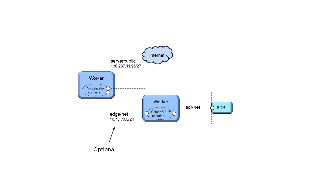
A Python notebook defines the testbed configuration. This notebook launches the visualization container within a testbed worker node, connecting it to either:
“serverpublic” (internet)
“edge-net” (internal network)
Containers can interact with the visualization system via public IPs or direct edge-net connections.
Testbed Configuration with Edge Interface
Alternatively, a user-defined router can facilitate communication between different networks.
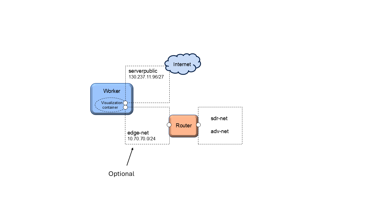
Testbed Configuration with Router Interface
Typical Setup Procedure
Setting up the visualization system is quick, secure, and repeatable. Follow these steps:
Run the appropriate Jupyter notebook:
visual_public.ipynb (for public access)
visual_public_edge.ipynb (for edge-net access)
Configure system parameters:
Ensure correct values are set in config_data.json
Have Grafana dashboard backup ready:
If needed, have Grafana dashboard backup ready in datasources.json/dashboards.json files
Run the configuration script:
Execute visual_config.py to initiate a sequence of setup scripts
For more details about the scripts, including how they work, how they customize credentials, etc, please refer to the README.md file in the Github repository.
Once the setup is complete, your visualization system will be up and running within minutes. You will have:
Secure credentials
A fully configured system
Grafana dashboards ready to visualize your latest experiments
By following this guide, you can deploy a robust and scalable visualization system for real-time data monitoring and analysis.